ChinaKnowledge.de -
An Encyclopaedia on Chinese History, Literature and Art
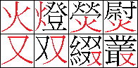
Unlike other logographic scripts like Egyptian hieroglyphs or cuneiform scripts, the Chinese script consists of characters that all have the same size. This has to do with the fact that one character stands for one syllable and one word. A simple character like 人 occupies the same space as a complicate one like 囊. Components of characters are accordingly reduced in size:
 |
|
The more complex characters are, the smaller are individual components. Yet standing alone, simple components like 火 or 又 occupy all the space reserved for one character. |
|
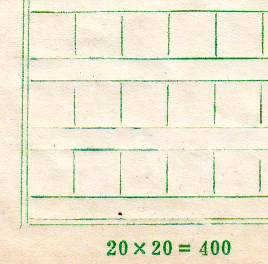
Chinese texts can be thought of as written in a grid of square fields (fangkuai 方塊) that have to be filled to all edges. Beginners therefore use to train writing by the use of grid-pattern paper. Yet such boxed are also used for drafts.
 |
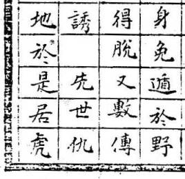 |
Left: Modern grid-pattern paper for drafting texts (written in rows from left to right). Right: Example of the manuscript edition of the Qingguoshi 清國史 (detail, written in columns from right to left). The blank cell signifies respect for the following words (xianshi 先世 "former generations"). In ready-made prints, this is done by a "line break" and positioning the first word a line higher than the usual line (see below). |
|
Because of predefined space for each character, complex characters are often not readable in prints of minor quality. Simple characters (wen 文, modern term dutizi 獨體字) are quite rare, at least seen from the whole thesaurus of characters, while compound characters (zi 字, modern term hetizi 合體字) make out 90 per cent of all characters. Most of the latter consist of two parts, either left and right or top and bottom. One of the two parts is mostly a phonetic part (sheng 聲, the phonetic, modern term shengfu 聲符), indicating roughly the pronunciation, and the other part indicates the field of meaning (xing 形, the signific, modern term yifu 意符). This type of character, to which most characters belong, is called xingsheng zi 形聲字.
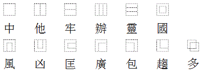
Characters can be divided into thirteen types according to their graphic composition (with examples):
 |
|
The composition of characters can be divided in solitary characters (like 中), horizontally divided ones (in two or three parts), vertically divided ones (in two or three parts), and various enclosures of differnt grades, from total enclosures like 國 to enclosures from three sides or just from two sides. The last type (多) consists of two overlapping components. |
|
The position of signific parts is relatively fixed. The components 亻彳口氵火木扌犭礻足, for instance, are mostly standing to the left, 刀卩阝攴見頁戈鳥 to the right, and 宀穴艹竹雨 to the top of other modules. This has become a standard with the creation of the chancery script, just like the sequence of the brush strokes that always go from left to right, from top to bottom, and from outside to inside.
The signific part of a character is called its radical (bushou 部首). The term bushou came up during the Later Han dynasty. The oldest surviving character dictionary, the Shuowen jiezi, classifies all Chinese characters it records into 540 radicals. During the Ming period 明 (1368-1644) the number of radicals was reduced and was fixed at 214. This number is traditionally connected with the Kangxi zidian 康熙字典 dictionary (as the so-called Kangxi radicals 康熙部首).
Character simplification in the People's Republic and attempts by various scholars to make character lookup easier has resulted in different systems of radicals. Characters that do not follow the principle of combining a phonetic with a signific element, like the huiyi or zhishi characters, are arbitrarily subsumed under one radical, for example 好 "good, to like" under 女 "wife", not 子 "child"; 去 "to erase, to do away" under 厶 and not under 土, and 不 "not" under 一, and not under 木. In the last two cases, the radicals are purely graphical and have nothing to do with the meaning of the characters.
What has also changed significantly in the last 2,000 years is the monosyllabic character of the language. Most nouns and verbs in modern Chinese are disyllabic, and it is therefore not any longer justified to say that one character represents one word. One has therefore to discern between character dictionaries (zidian 字典) and word dictionaries (cidian 辭典 or 詞典).
Chinese is traditionally written in columns from right to left, according to the natural material of bamboo strips. Still today, plates or rolls on the left and right sides of entrances or of altars, and also the title on the back of a book are written in single columns. Horizontal plates are traditionally written from right to left, like in Taiwan, Hong Kong and the overseas Chinese communities. In the People's Republic, the Western style of writing in rows from left to right has generally been adopted.
| 恭 喜 發 財 "Wishing good luck and prosperity" (New Year's Roll, from top to bottom) |
民。 在 止 於 至 善。 知 止 而 后 有 定。 定 |
大 學 之 道。 之大 學學 道大 也人 在 明 明 德。 在 親 |
Left: Beginning of the "Great Learning" (in columns from right to left) Commentaries on the main text are often written in smaller characters and in two columns within one. "What the Great Learning teaches (commentary: 'Great Learning' means the way to study by adult people), is to illustrate illustrious virtue; to renovate the people; and to rest in the highest excellence. The point where to rest being known, the object of pursuit is then determined, a [...]" |
| 司公限有具工械機發兆 Shiu Fat Machinery and Tools Co., Ltd. (Hong Kong, from right to left) |
|||
| 中华人民共和国万岁 "Long live the People's Republic of China" (from left to right) |
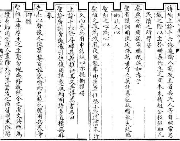
In imperial times, words and expressions pointing at the emperor or the emperor's forebeards were written a line higher than the usual text.
 |
|
Foreword of the the Shengyu guangxun 聖諭廣訓, instructions by Emperor Shizong 清世宗, the Yongzheng Emperor 雍正帝 (r. 1722-1735) of the Qing dynasty 清 (1644-1911). When words occur pointing at the emperor's father or having the meaning of "emperor, imperial", a line break is made, and the word of honour is put a line higher, in this example no less than nine times. This is somewhat confusing because a line break does not singify the end of a sentence. Siku quanshu edition 四庫全書. |
|
Traditional texts do not know any punctuation. This fact even poses a problem to modern Chinese readers of old writings. Punctuation has only been introduced in the early 20th century. Western names and surnames (Bālākè Hóusàiyīn Oūbāmǎ 巴拉克•侯賽因•歐巴馬 "Barack Hussein Obama") are divided by a • mid-level dot.
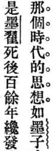 |
Example from the Republican-period book Zhongguo zhexue shi dagang 中國哲學史大綱 by Hu Shi 胡適, published in 1917 (in Minguo congshu 民國叢書, Series 1, Vol. 2). Waved lines are used to stress book titles (Mozi 墨子), straight lines for personal names (Mo Di 墨翟), and circles 。。。 to highlight important phrases. |
There are two types of commas, one of them the one、 two、 and three listing comma. 「Quotation marks quoting 『what someone has said』」 are different from those known in the West, but 〝Western-type quotation marks〞are also used, mainly in the People's Republic. 《Book titles》 are often written in in double or 〈single parentheses〉, and there are also some special brackets for 〔remarks〕 and 【entries in lexica】. Punctuation marks of all types (。?!:;,.…) are broader than Latin letters in order to fit with the space of Chinese characters. The repetition sign 々 is quite rare in Chinese prints, but is quite commonly used in Taiwan (following the Japanes example, where it is widespread).
In very old inscriptions (oracle bone and bronze vessels) the repetition of a word was signified by a small character "two" ニ. For texts written in columns, special marks are provided (︽︾︻︼﹁﹂). In older texts, important words are marked by dots to the right to signify the author stressing this passage. Some modern editions of ancient texts, especially those of the Zhonghua Shuju Press 中華書局, underline personal and place names, as well as the titles of books. In Taiwan, the texts of many books are accompanied with the Zhuyin transcription written in small letters to the right of the characters.